P-Control Chart Software Overview
Our P-Control Chart Software provides real-time monitoring and visualization of production quality. It helps manufacturers track inspection quantities, defect counts, and defect ratios across daily and night shifts, giving clear visibility into process stability and deviations.
Key Features
Defect Logging (NG)
Capture and categorize defects with easy input (+NG / -NG).
Automatic Ratio Calculation
Real-time defect ratio (%) calculation with cumulative inspection tracking.
Trend Chart Visualization
Interactive control chart with monthly view, highlighting spikes in defect rates.
User Accountability
Checked and verified by AGM, Supervisor, and Team Leader with timestamped records.
What We Do
We deliver a complete quality monitoring solution designed for manufacturing.
System Design & Customization – Tailored P-Chart setup to match your process and inspection needs.
System Design & Customization – Configure P-Charts for your production and inspection setup.
Software Deployment – Install and integrate the system into your workflow.
Hardware & Interfaces – Supply scanners, operator panels, and data capture devices.
Training & Documentation – Train operators and supervisors with SOPs and manuals.
Quality Reporting & Compliance – Generate standardized digital records for audits.
Ongoing Support – Provide updates, remote troubleshooting, and process optimization.
System Workflow
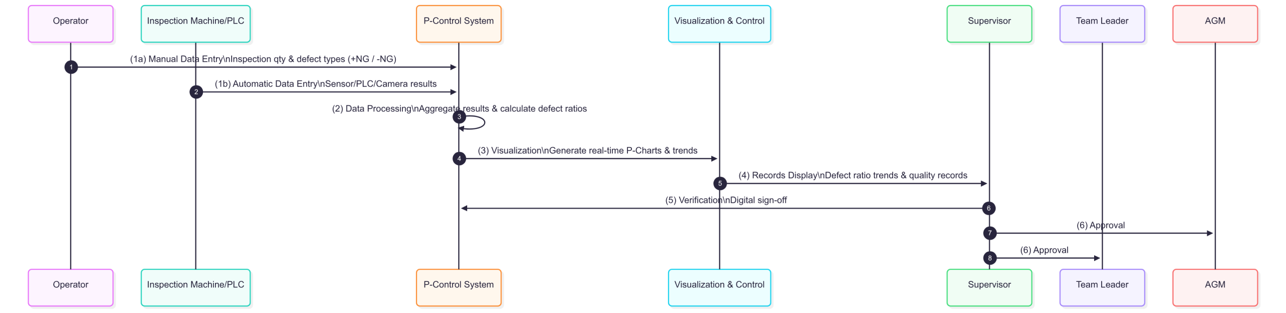
Data Entry – Operators input inspection quantities and defect types with quick +NG / -NG logging.
Data Processing – Aggregates inspection results across shifts with automated defect ratio calculations.
Visualization & Control – Generates real-time P-Charts with defect ratio trends and alerts.
Verification & Approval – Quality records digitally signed by Supervisor, AGM, and Team Leader.
Continuous Improvement – Historical analysis supports root cause analysis and quality improvement projects.
Use Case: P-Control chart alert system
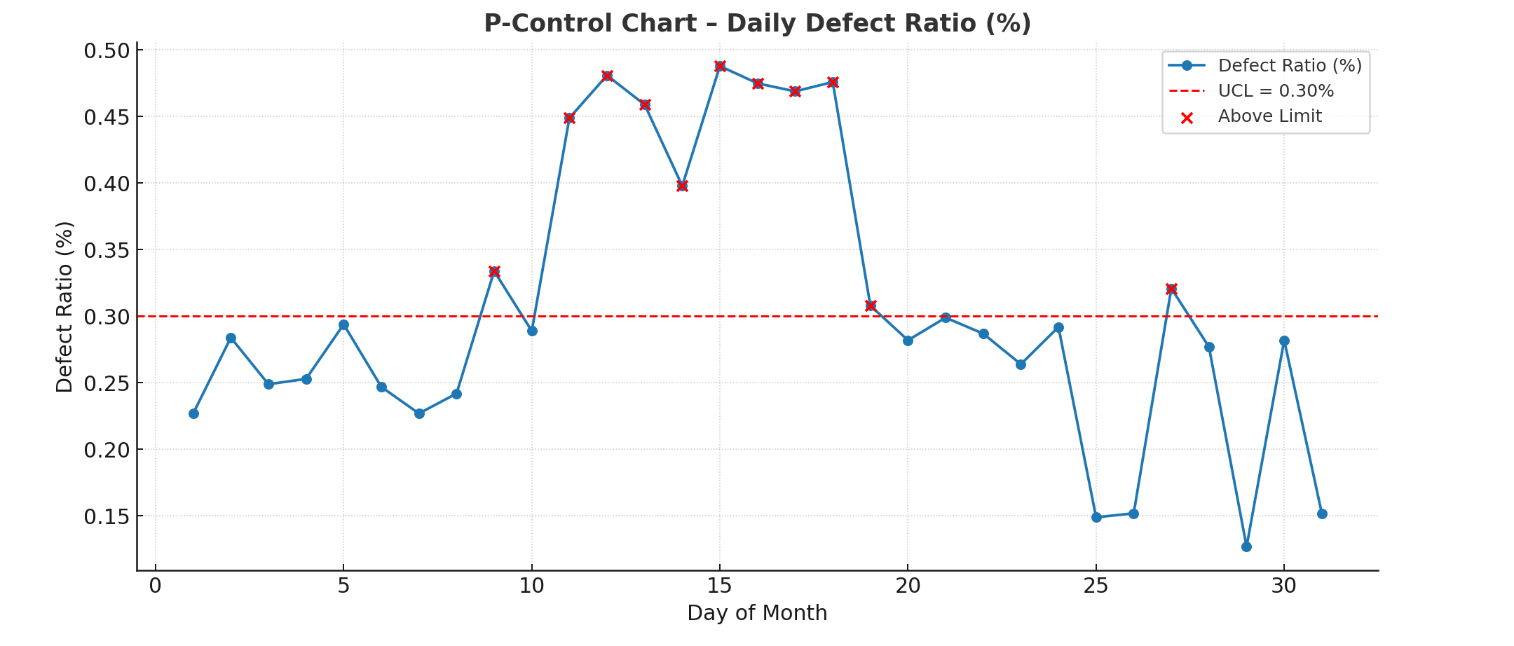
What it Shows
X-Axis (horizontal): Days of the month (1–31).
Y-Axis (vertical): Defect ratio expressed as a percentage (%).
Blue line with circles: Daily defect ratio values calculated from inspection results.
Red dashed line: The Upper Control Limit (UCL = 0.30%) – any point above this line signals potential instability.
Red highlighted points: Days where the defect ratio exceeded the control limit.
Key Observations
Most days fall well below the 0.30% UCL, indicating normal process variation.
Starting around Day 11 through Day 19, there’s a cluster of consecutive points above the UCL.
This streak lasted 9 consecutive days.
Maximum defect ratio in that streak is about 0.45%, well above the limit.
Total points above the limit: 11 (out of 31).
Alert Evaluation
The system checks two rules:
Condition A: More than 7 points above the limit. → ✅ True (11 points)
Condition B: 7 or more consecutive points above the limit. → ✅ True (9 consecutive days)
🔴 ALERT TRIGGERED – Both conditions were met, signaling the process is out of statistical control and requires investigation.
Remark: The alert conditions are fully configurable. Users can adjust the point threshold, consecutive streak requirement, and UCL values to match their own quality standards, customer requirements, or internal control policies.